
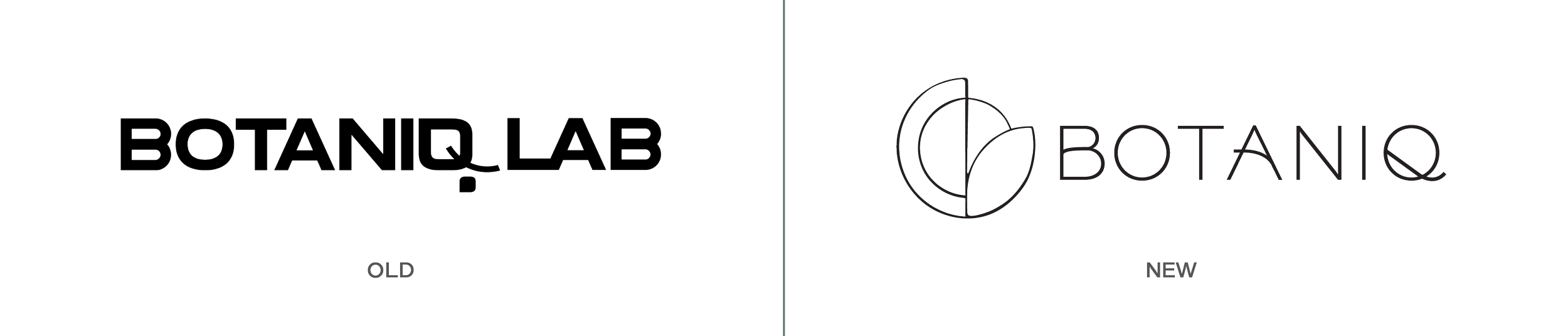
Botaniq
Rebranding and visual language development for an international living decor brand.
An international brand experience
Design Objective
Create updated branding and visual language for an established living decor brand that will operate in two distinctly different cultures.
Design Overview
The new Botaniq brand will continue to serve the European market while expanding into the price cautious sector of the American home decor market.
Designing For

PRACTICAL European consumers
A discerning individual who values quality, simplicity, and functionality. They prioritize practicality in their purchasing decisions, seeking products that not only beautify their homes but also serve a purpose. They seek plant products that require minimal effort, adding a touch of nature without adding complexity to their lives.

Price-conscious American
A budget-savvy consumer who desires to bring a touch of luxury into their lives without breaking the bank. They appreciate products that offer quality, style, and affordability. When it comes to plants, they see the value but are mindful of their spending. They may be new to plant ownership but are willing to explore the industry if the cost of entry is low.
Brand System
Botaniq, a part of the LiveTrends Design Group family, embodies the essence of accessible design for both European pragmatists and budget-conscious Americans. Rooted in Scandinavian simplicity, its minimalist yet well-crafted living decor products harmoniously blend quality, functionality, and affordability.
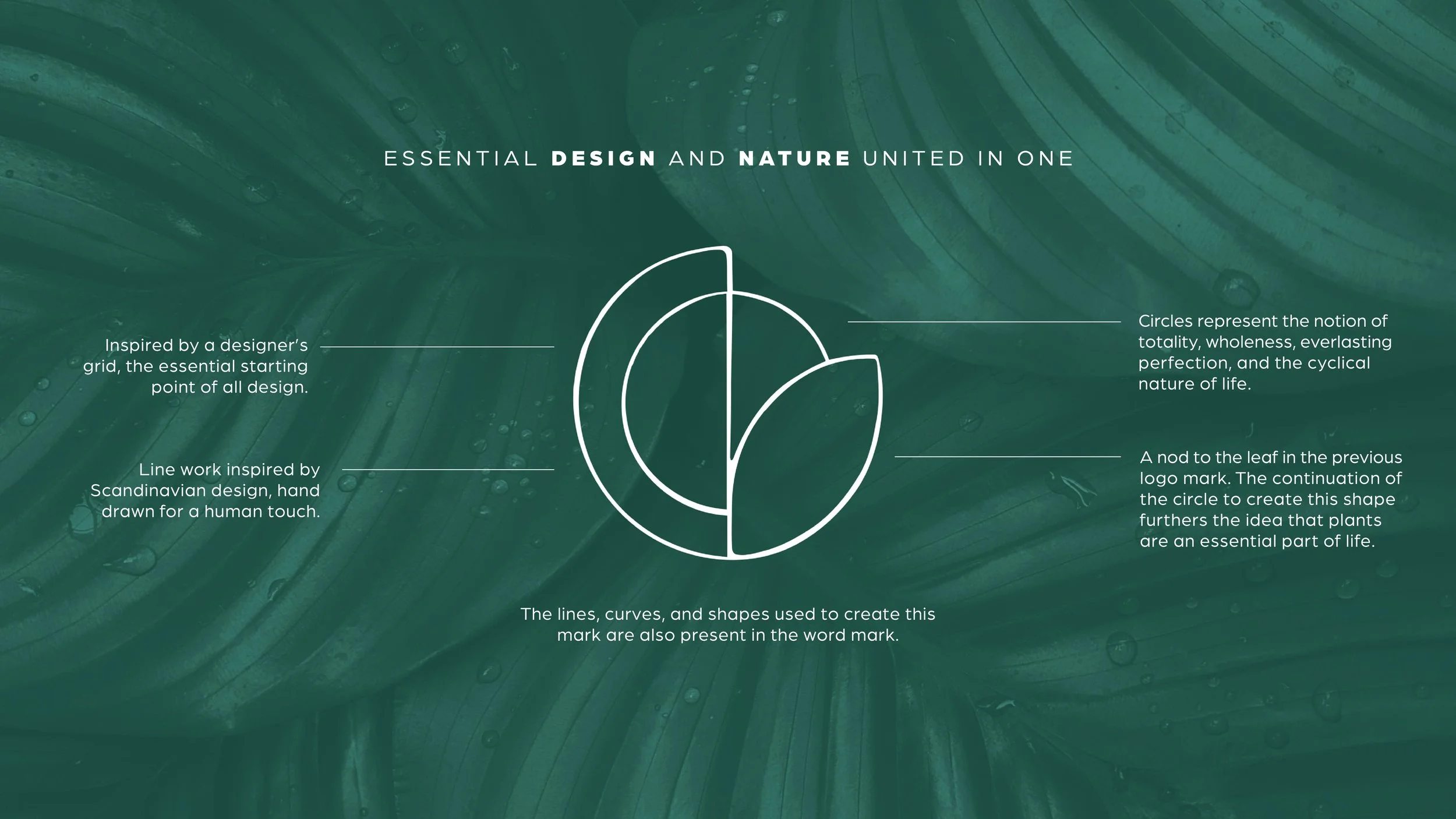
With a circular brand mark symbolizing both a designer's grid and the growth of nature, and a serene color palette inspired by Scandinavian hues, Botaniq is your gateway to embracing a life filled with greenery.
Brand CONSIDERATIONS
Alignment with Parent Brand
Ensuring that the Botaniq brand fits seamlessly into the existing LiveTrends Design Group brand family, maintaining a consistent circular brand mark and san-serif typeface for visual cohesion.
Visual Symbolism
The deliberate choice of visual elements in the brand mark, such as the designer's grid, sun-like circles, and the growing leaf, conveys the brand's ethos and connection to nature.
Cultural Significance
Drawing inspiration from Scandinavian design principles, as an ode to where the brand originated.
Target Audience Differentiation
Recognizing the distinct needs and values of both practical European consumers and price-conscious Americans and tailoring the brand to resonate with both demographics.
Geographic Expansion
Considering the brand's expansion into both European and American markets and tailoring messaging and design to suit the preferences and expectations of each audience.
Affordability and Quality
Balancing the perception of affordability with a commitment to quality and style in the brand's image and product offerings.


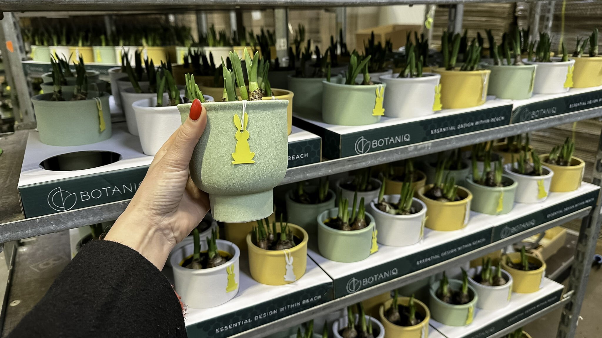
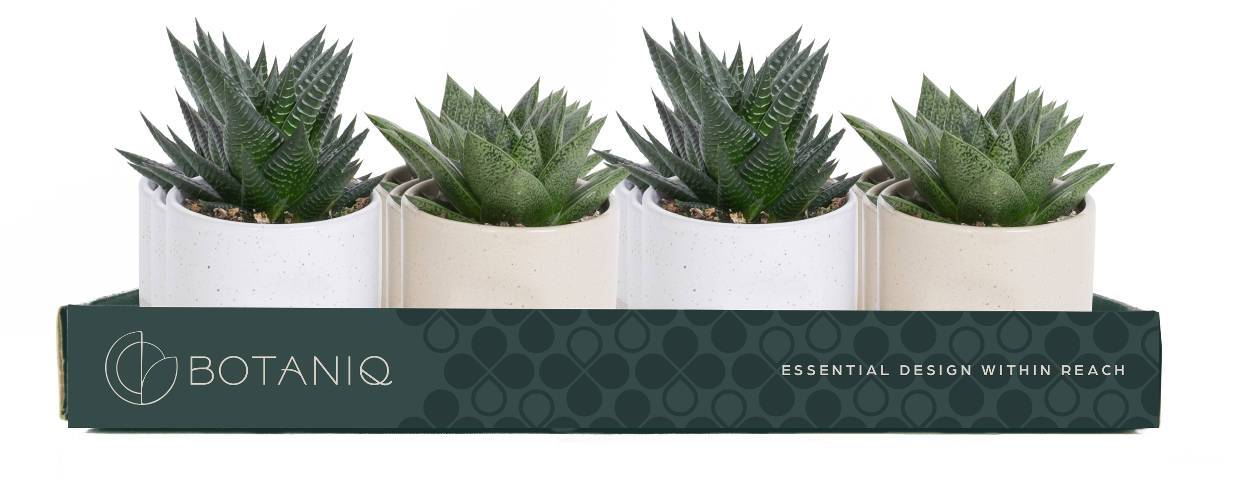
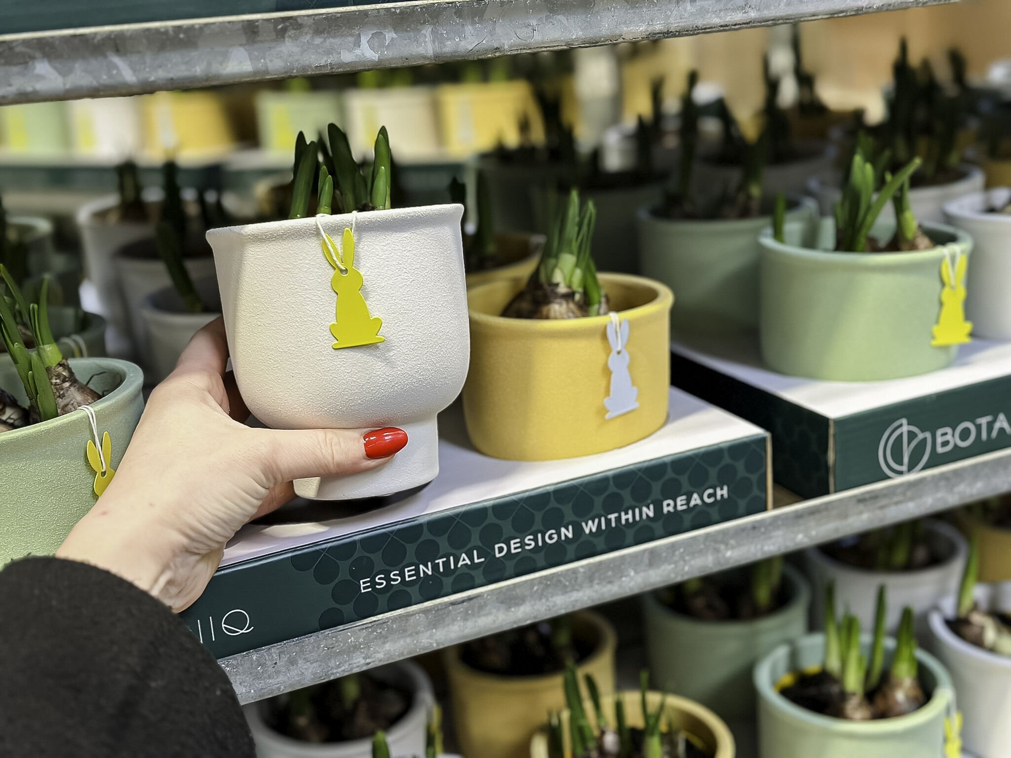
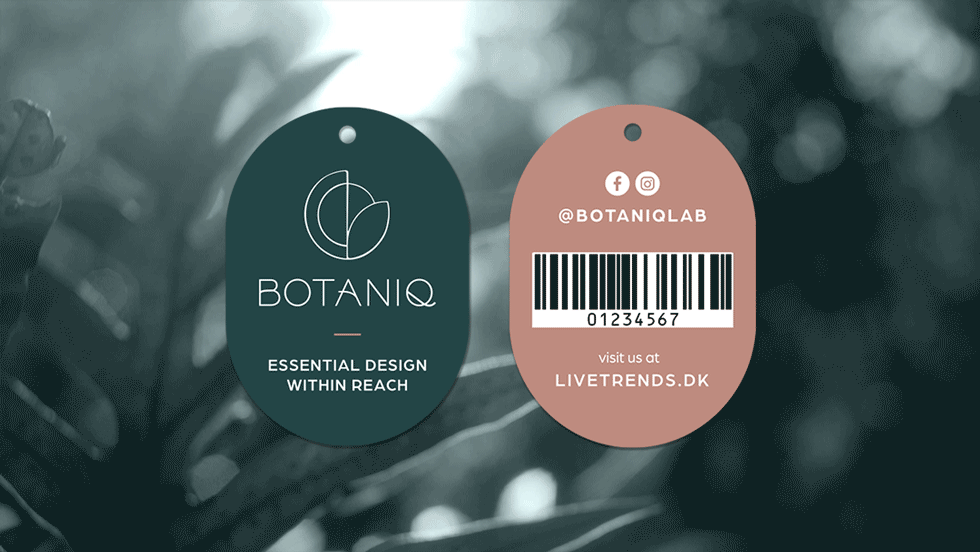
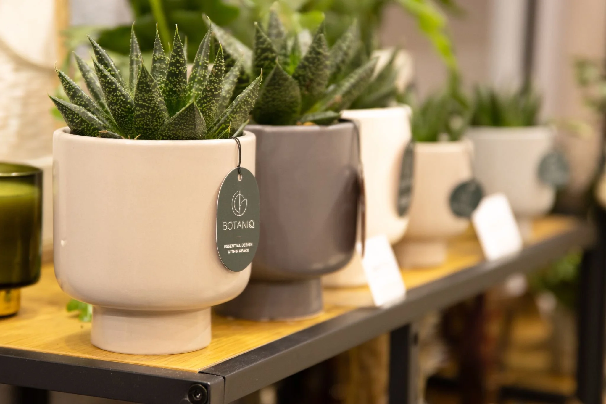
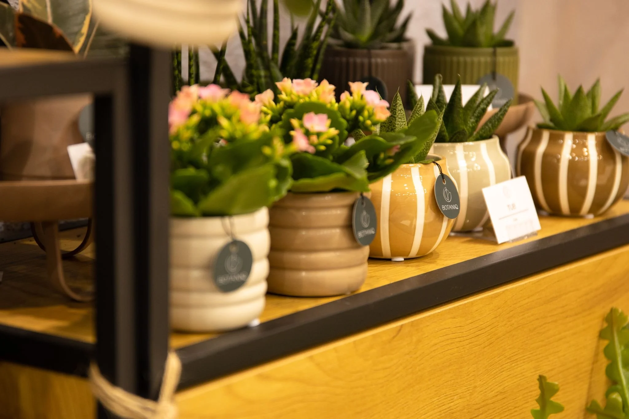
Product Tags
The Botaniq products are intentionally kept simple. They are a reflection of our design philosophy, a practical choice to manage costs, and a deliberate decision to keep the spotlight on the beautiful plants and pots they adorn.
Branded PRODUCT Displays
These trays serve both as in-store display vehicles as well as functional shipping trays.